During my last longer vacation in the USA, I connected my phone to a lot of Wi-fi networks, all of which I have never used before and could not evaluate how secure they would be, from hotel Wi-fi to Airport networks.
Because of this, I decided that I wanted to study the current iOS 16 network settings screen, and see what could be done to make browsing public networks more secure and aware.
Tools used:
Authentic
Informative
Phone-ready
With the initial goals/objectives for this design defined, I made an initial list of content that I wanted to add.
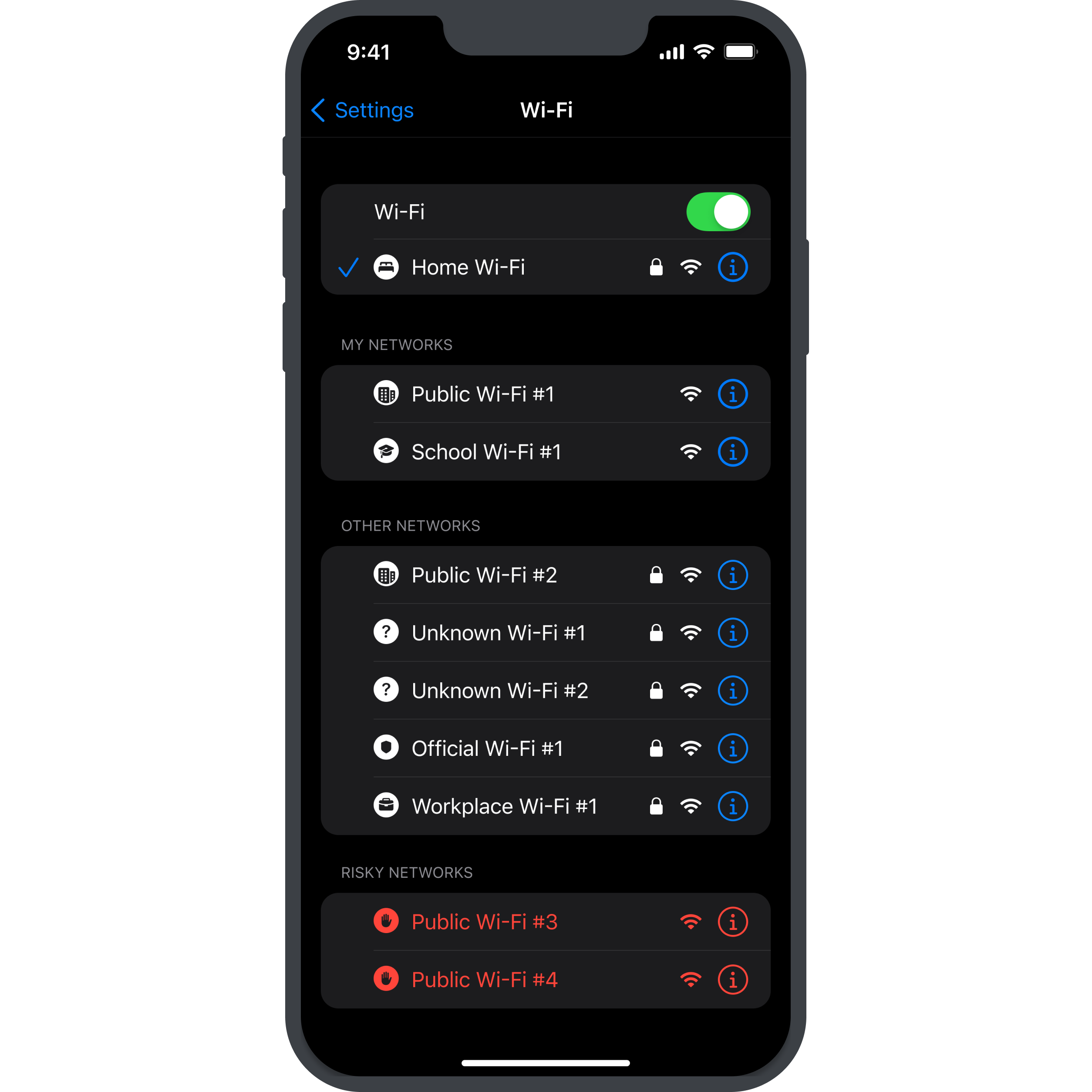
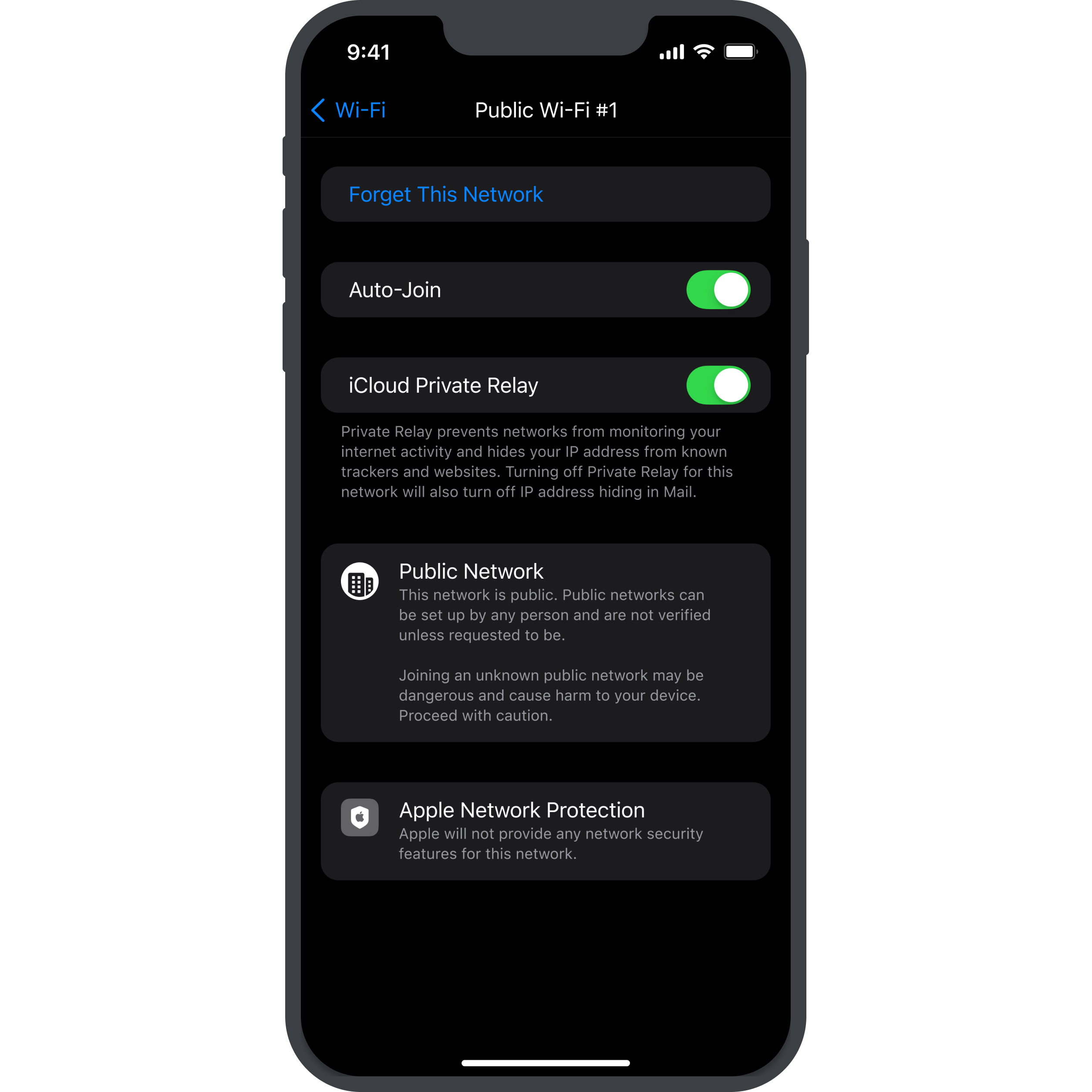
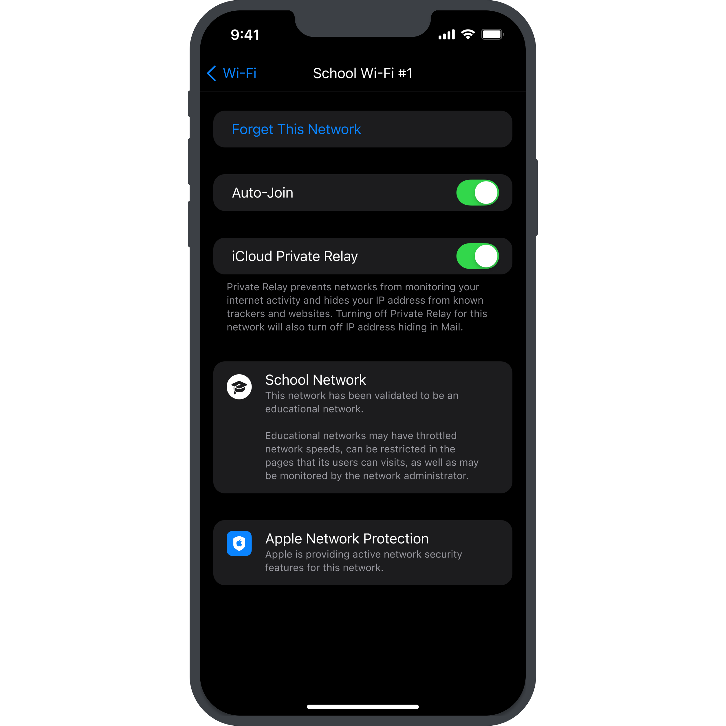
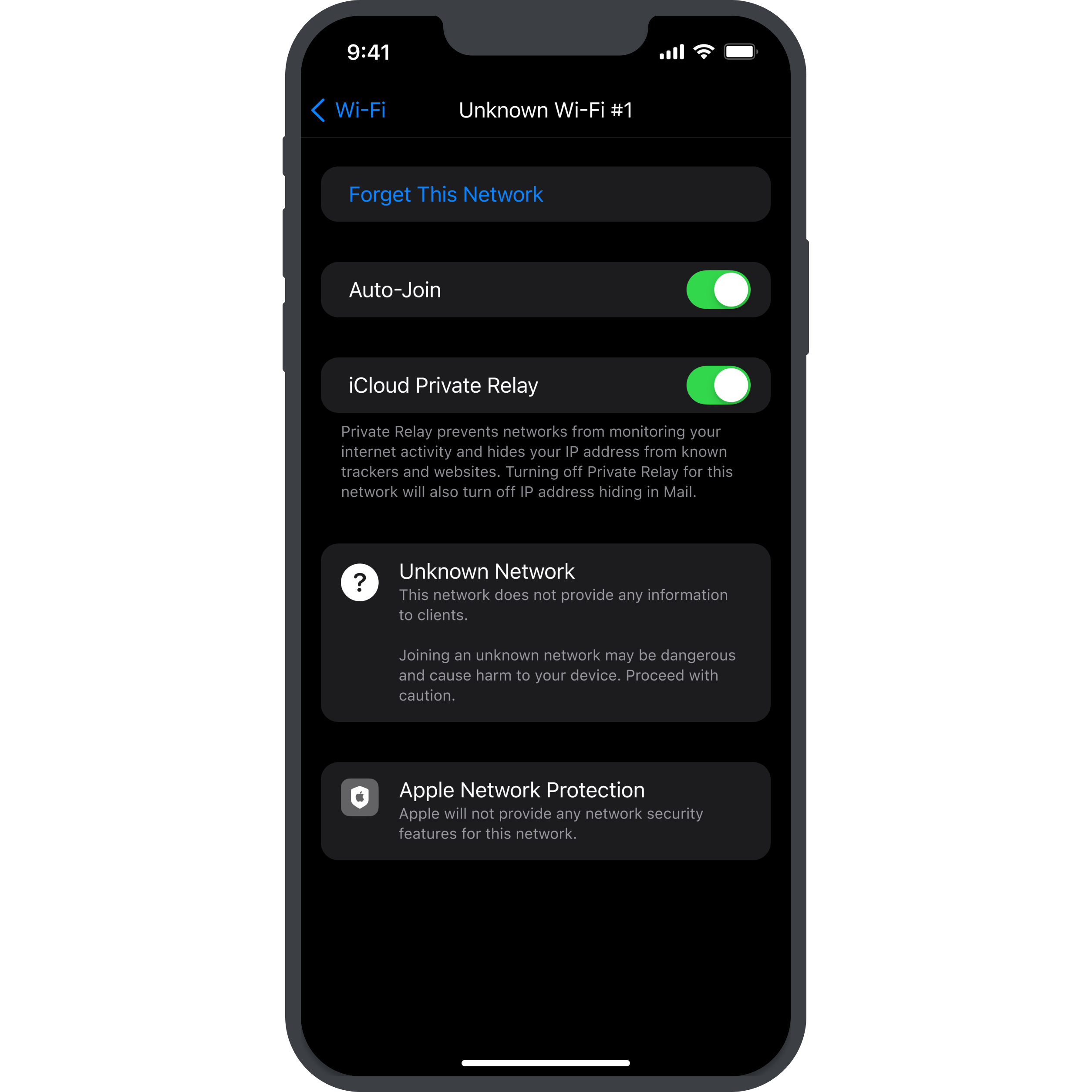
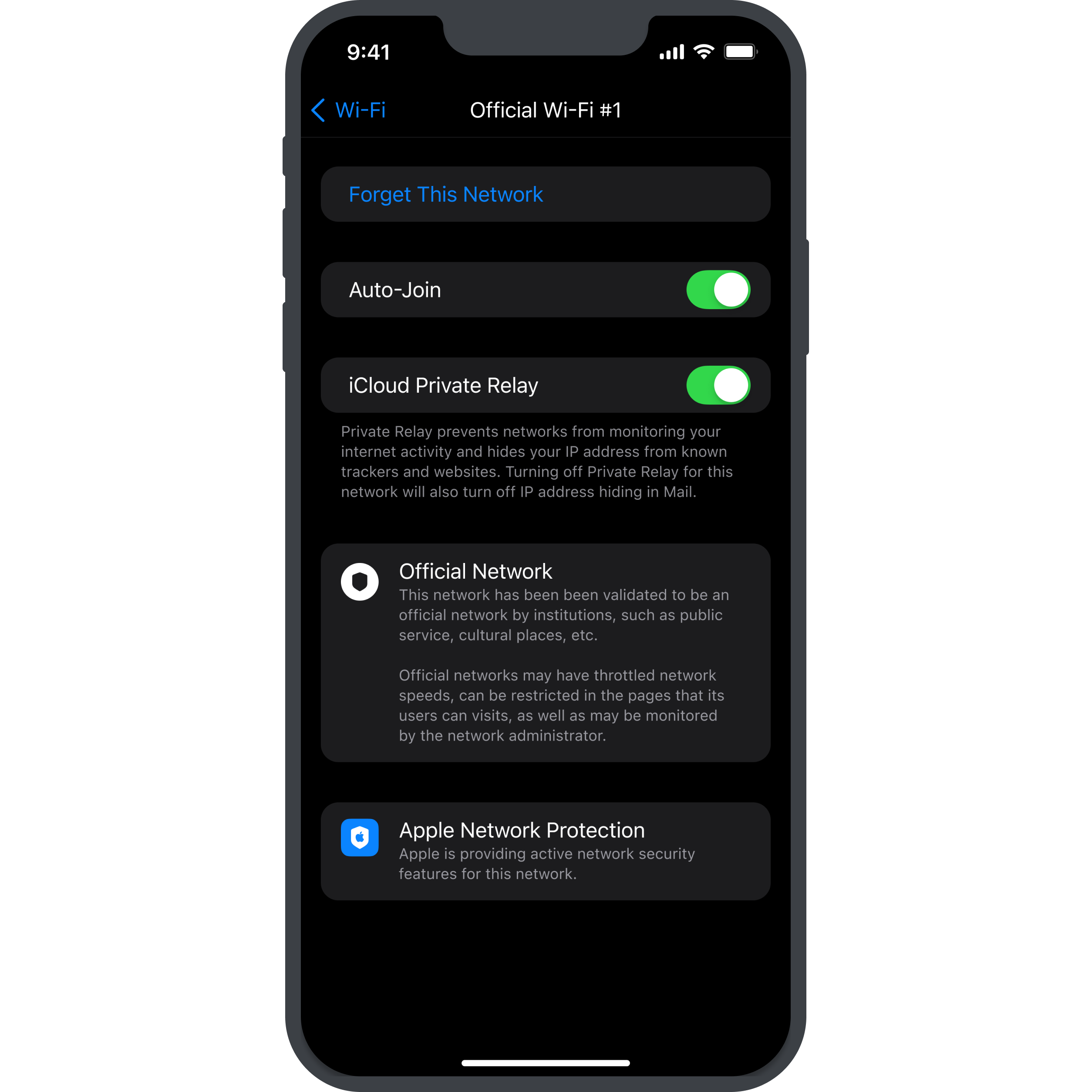
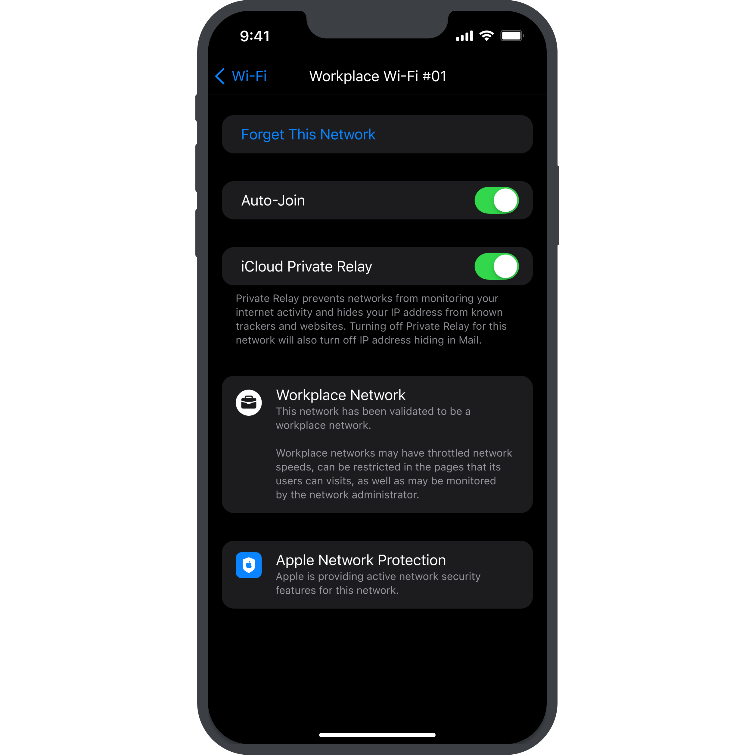
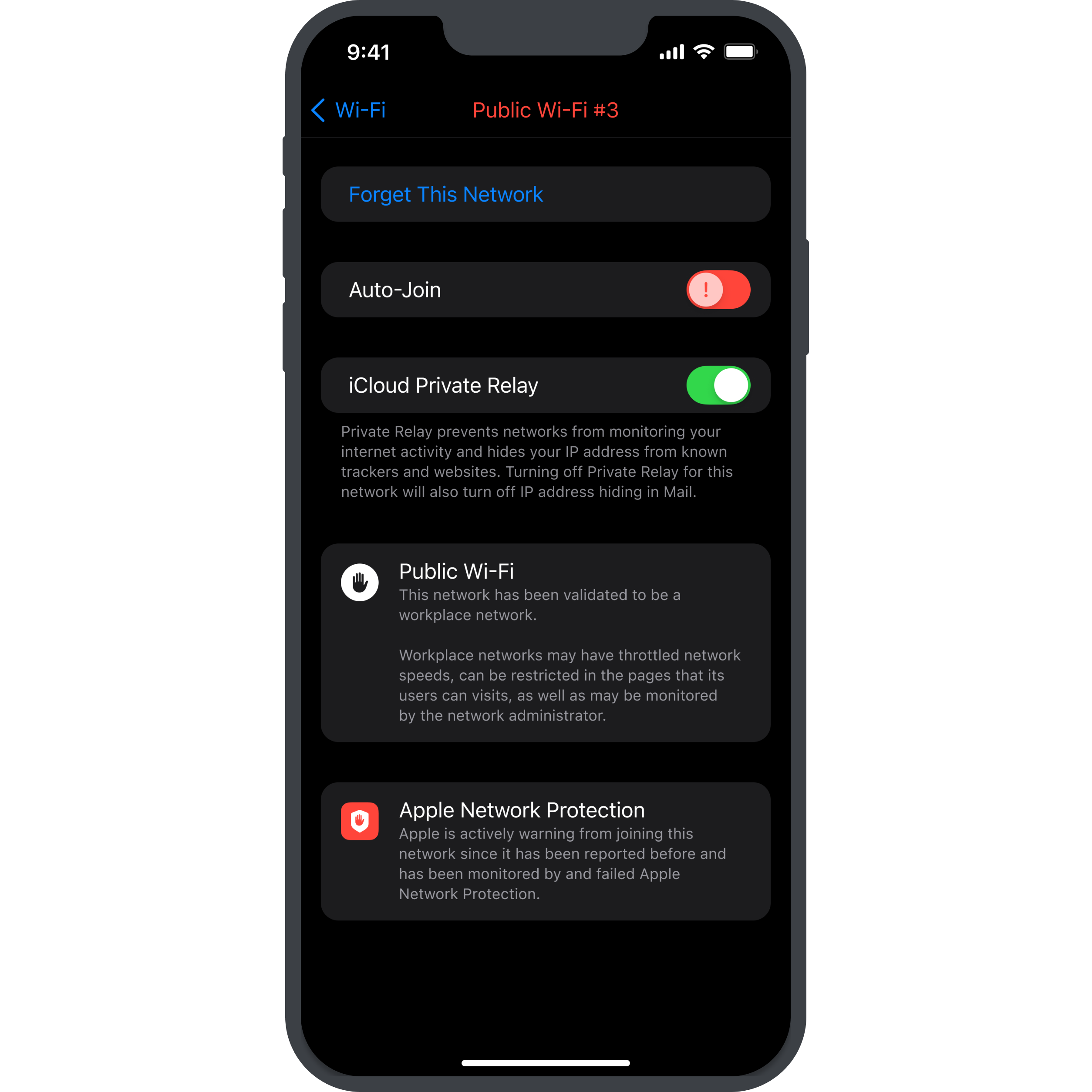
I knew that I wanted to add the following network types symbolized for users to see what network they would join in (this could be configured in the network settings by the network owner): Home, Public, School, Official & Workplace
All of these network types should have different icons and info text below them to inform the user of what access rights, etc. the network would have (for example, workplace networks might have throttled network speeds and might restrict access to certain websites).
Additionally, I also thought up some kind of Apple-provided network protection system that network providers could purchase for their network. Since Apple currently does huge strides in regards to privacy and security features, I felt like this would be something that Apple would do!
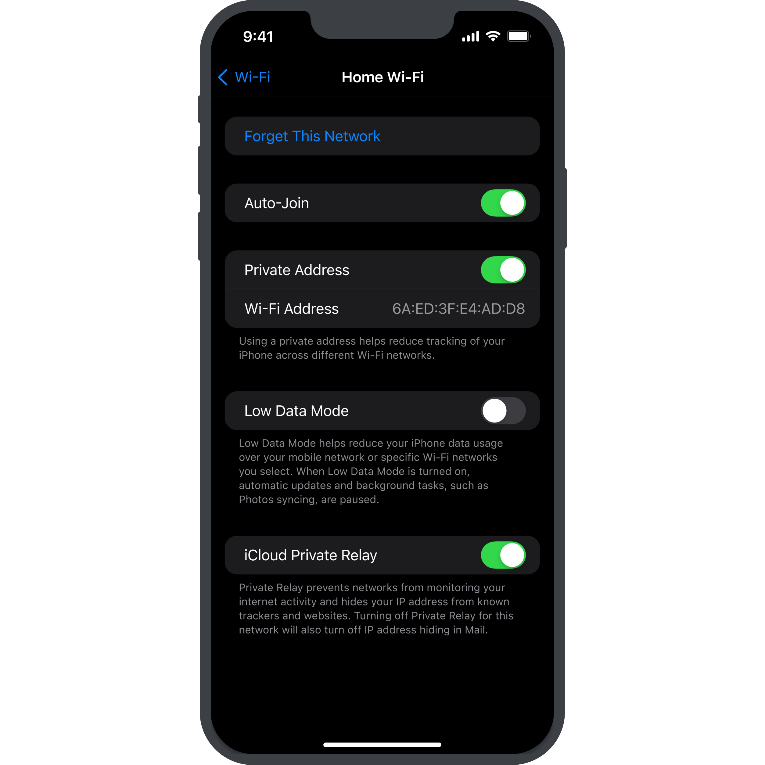
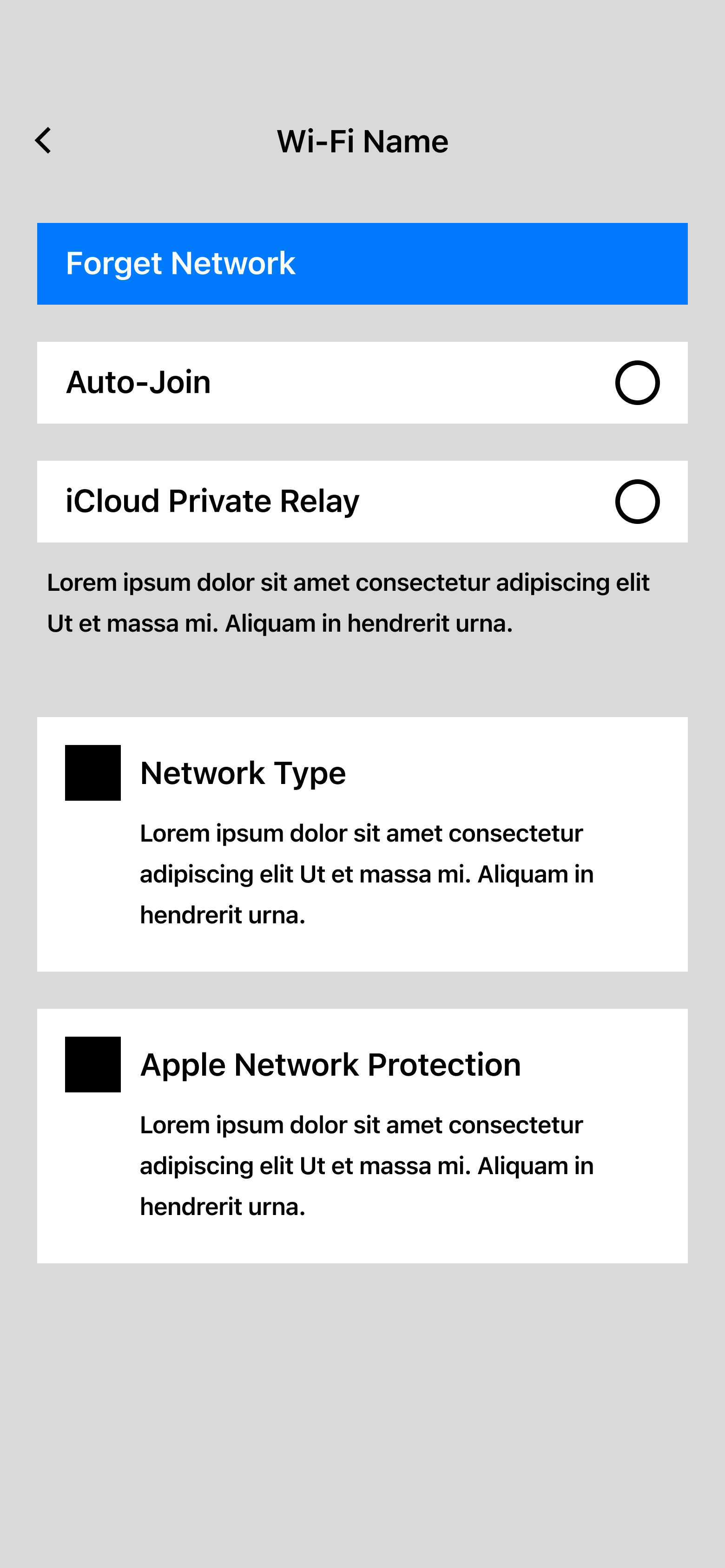
This is a screenshot of the current network settings screen in iOS 16.
The screen is very familiar and has not drastically changed throughout the latest version updates.
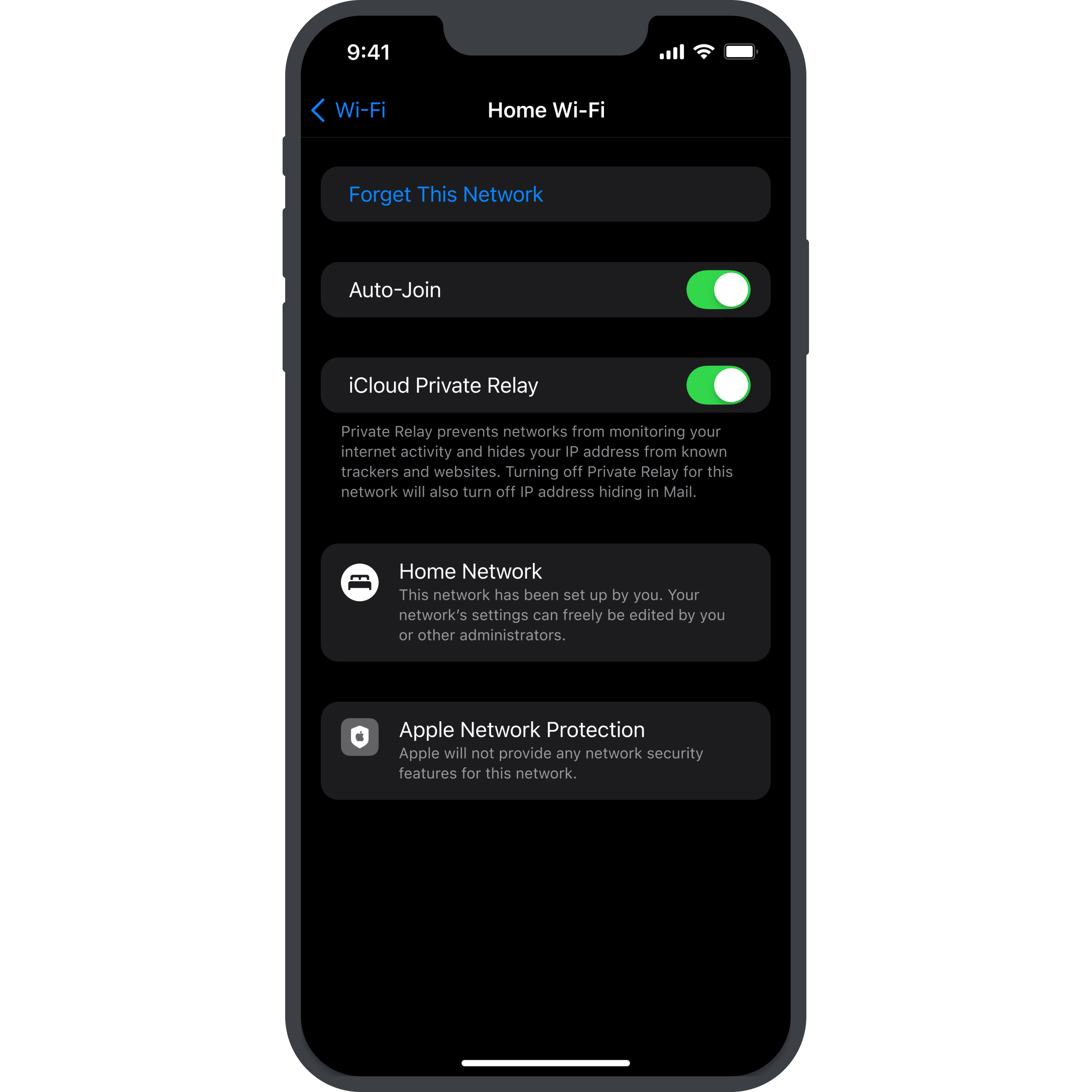
However, there are a lot of important elements here. First and foremost, the most important button is the join/forget network button, closely followed by the option to toggle auto-join, which will make your phone automatically connect to the network as soon as you enter its network radius.
While important, I decided to remove the options “Private Address”, “Wi-fi Address” and “Low Data Mode” in my mockups. This does not mean that these options are not important, but I would most likely put them lower on this screen, requiring the user to scroll down to find these options!
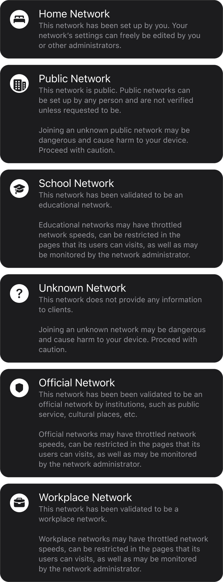
These are the different panel options for network types that I have created.
As you can see, they all have different iconography to represent their type (I tried to find the most fitting icons out of the iOS icon library, so some icons might not be 100% fitting).
Additionally, they all have different information about the network type, such as their security, network speed throttling, website blocking, traffic tracking, etc.
Ideally, this will give users enough information about the network they want to join to help them decide whether or not to start browsing in this network!
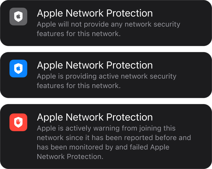
These are the panels for the Apple Network Protection, an imaginary service provided by Apple to purchase for one’s network.
This service would allow the network to be protected by Apple’s security AI, and constantly gather information about websites, the scripts they run, the protocols present (or not present), etc.
This panel can have 3 statuses:
No Protection Provided
This will most likely be the most present state – this means that the network provider has not purchased the optional Apple Network Protection service.
Protection Provided
This immediately looks different by the blue background behind the shield. The blue tone is an iOS default color tone, but is generally associated with security, corporate, etc. Ideally, public places, such as hotels, airports, and of course Apple Stores).
Network Warning
Apple actively warns the user of this network, since it has been reported before/has been involved in public scandals (data leaks, etc.).
I started this project by greyboxing the current version of the iOS network settings screen in order to get a general idea of the layout and distribution of information, using basic boxes with labels on them.
Next, I re-arranged/removed some of the contents and added the new elements that I wanted to have in this concept, again in a low-fidelity version as to just check for the layout and communication of information.
After having created my greybox for the screen that I wanted to create, I started looking into the offical iOS UI library for Figma.
I downloaded the library and checked out the different elements that were present. I managed to find a screen that had the current version of the iOS network settings and copied this to do my changes.
I removed the elements that I deemed not too important for my concept and looked for an element that suited my needs for my new features – a box with a header and a text box, with an icon/graphic on the left of the box. I found a similar element, so I only had to do slight adjustments.
After knowing what the final element would look like, I started creating the graphics for these elements – I looked into the official iOS icon library and started collecting the elements I needed – various different locations/settings, such as a school, a house/home, a suitcase (for the workplace), etc. I used these icons and added them to white circles as backgrounds, kind of like badges.
The second graphics that I wanted to create was the Apple Network Protection icon, which uses the official iOS shield icon, with the official Apple icon on top of it.
To conclude, I can say that I really like the iOS design system – it is very clean and logical, the spacings and sizings are all universal and very aesthetic and the general layout and color schemes are just overall really appealing.
However, I can also say that while I really like the style, it is not the easiest to replicate – it is easy to add an icon in the wrong place or mess up a spacing and it immediately makes it looks less “Apple”.
The designers and artists at Apple definitely are very talented and experienced, and I aspire to reach their proficiency at some point in my career!