For some time now, I had the feeling that the iOS Call ecosystem is unnecessarily split between multiple apps, while their behaviours and user flows are rather similar. For this reason, I decided that I wanted to do a case study in which I combine the Calls, FaceTime, and Contacts apps.
Tools used:
Authentic
Useable
I started by browsing through the different apps I wanted to combine. The apps that I was capturing references from were:
- Calls
- FaceTime
- Contacts
Once I had all my screenshots collected, I picked the ones I wanted to integrate into my design. The screens I selected to include were:
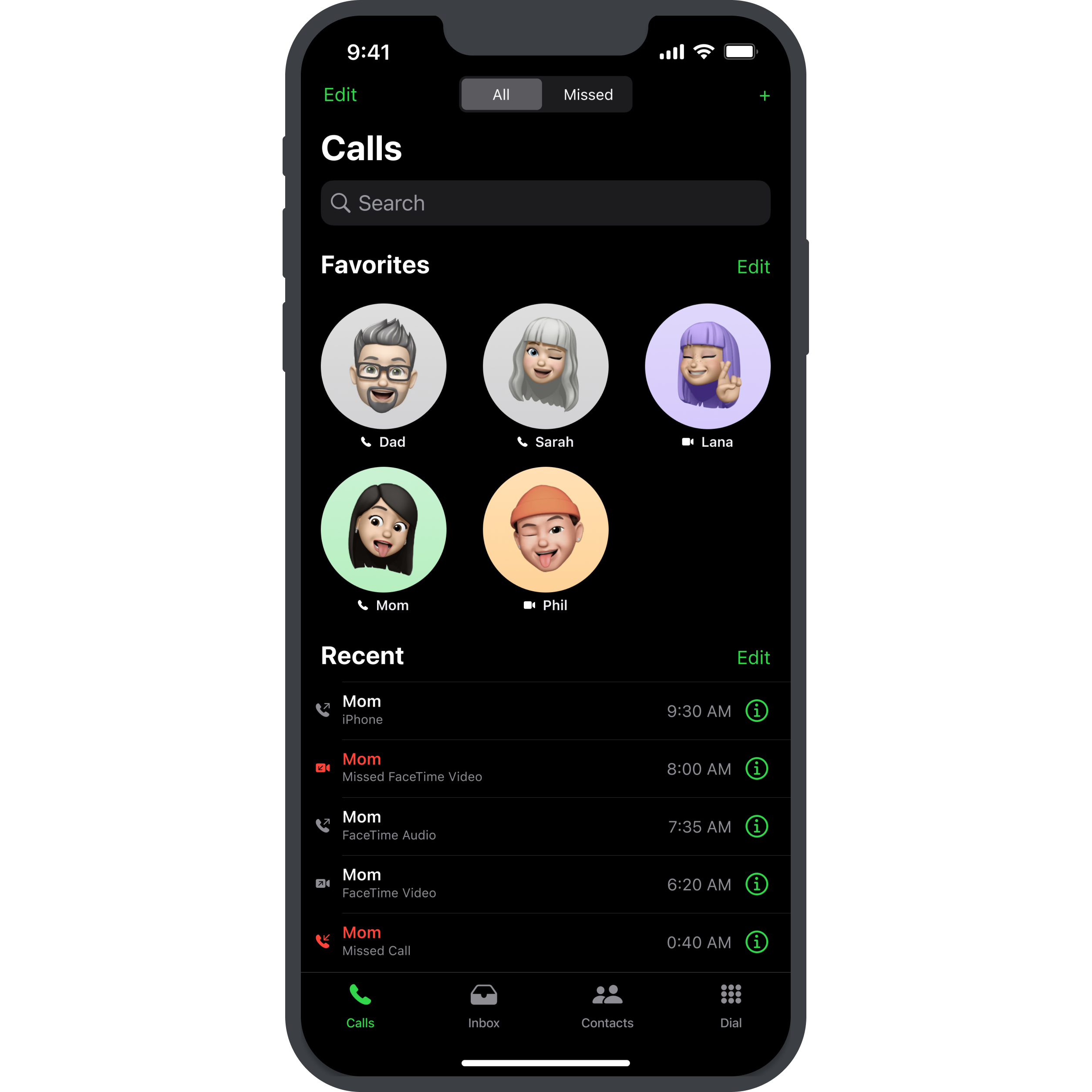
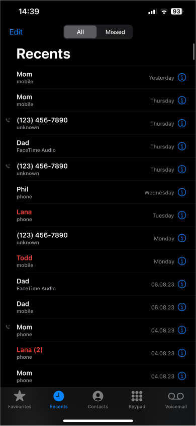
- Calls (call your favorite contacts, or call back recent recipients)
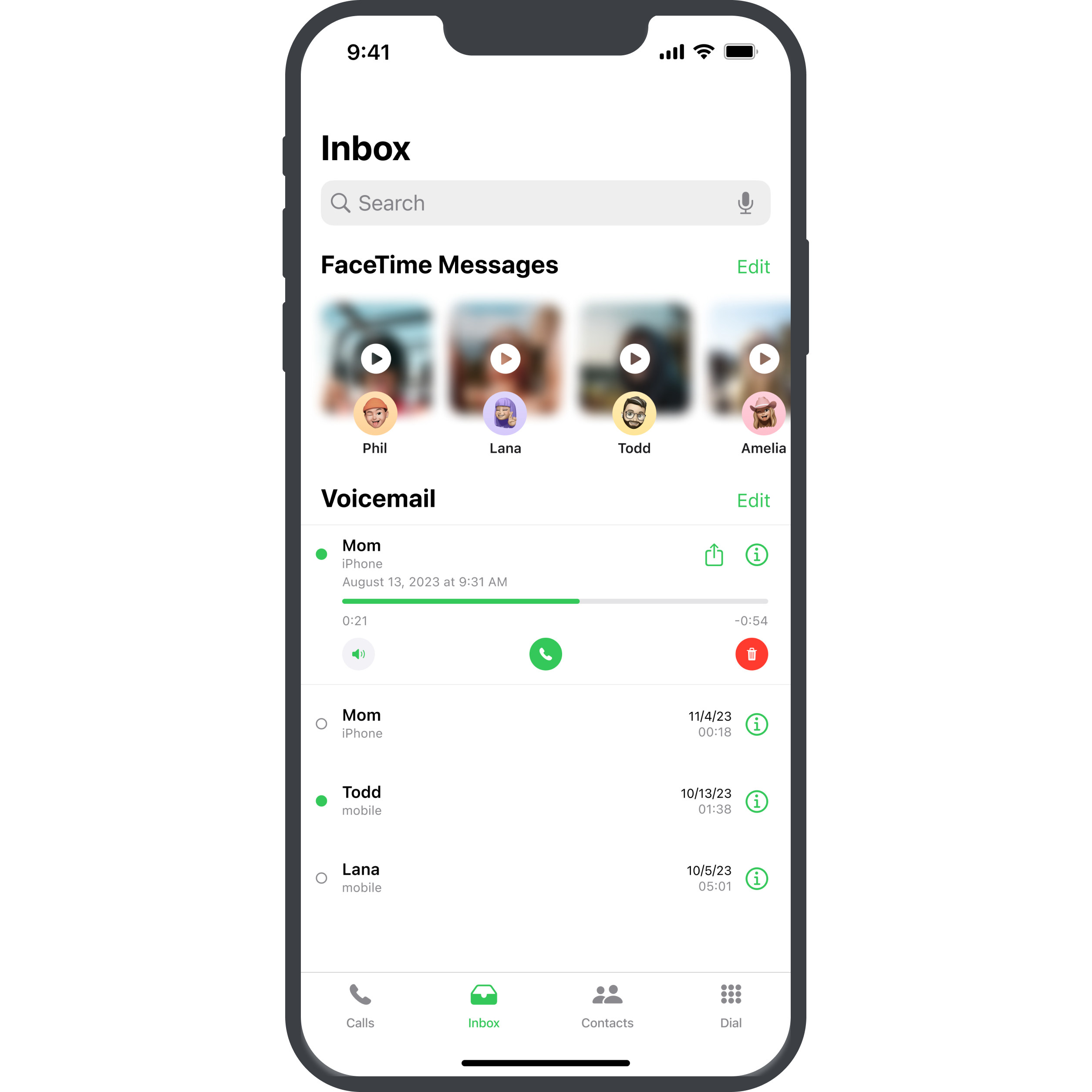
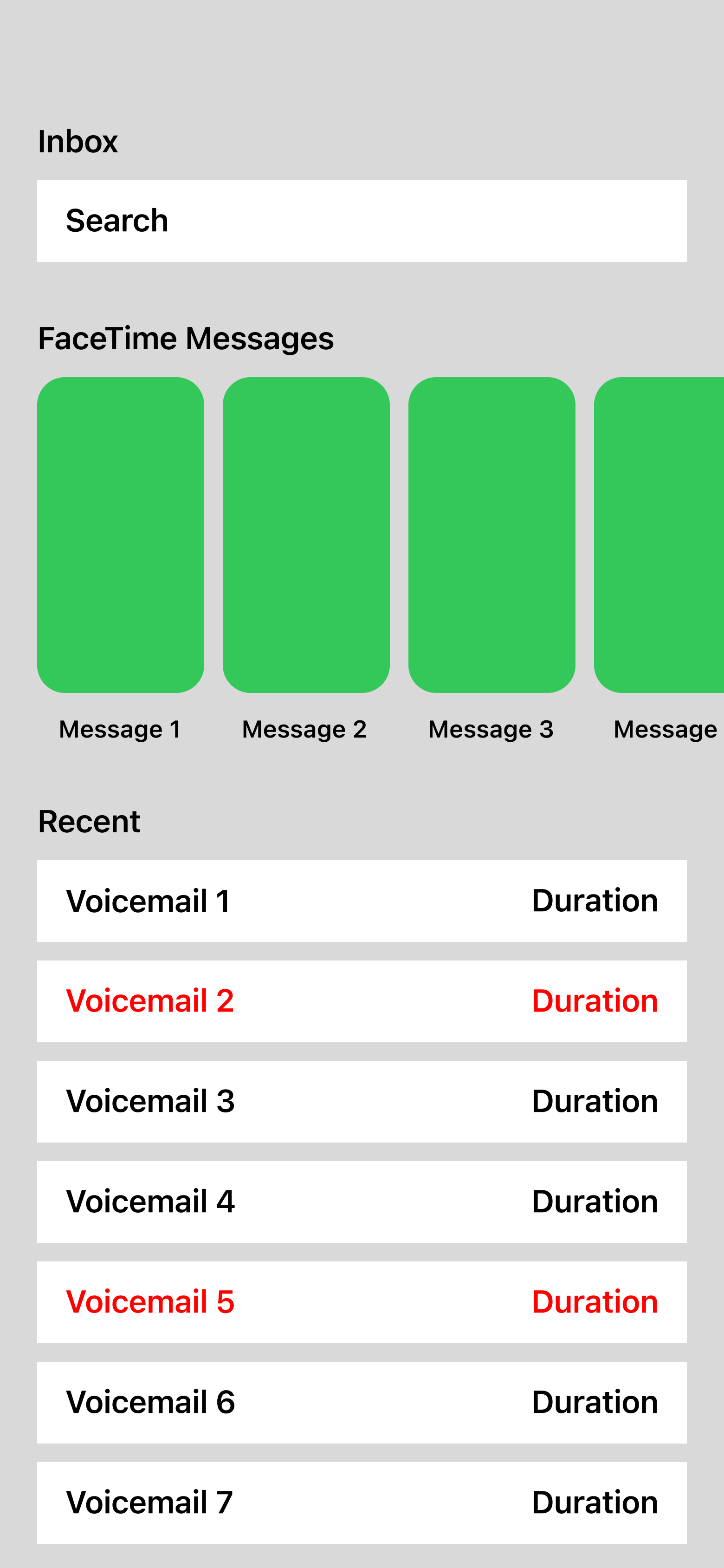
- Inbox (see recently missed calls, as well as mailbox messages (recently, FaceTime video messages have been included into iOS 17))
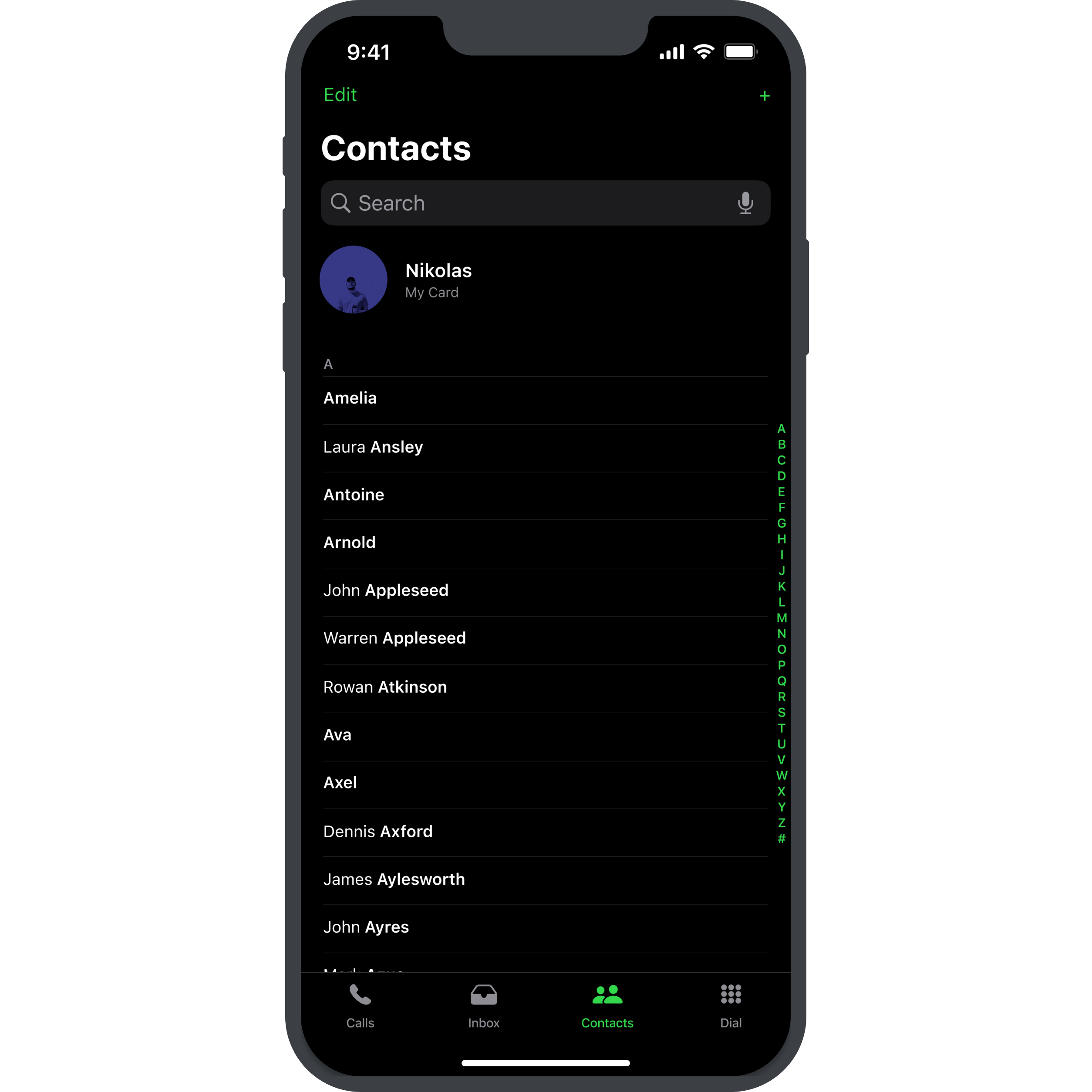
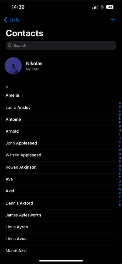
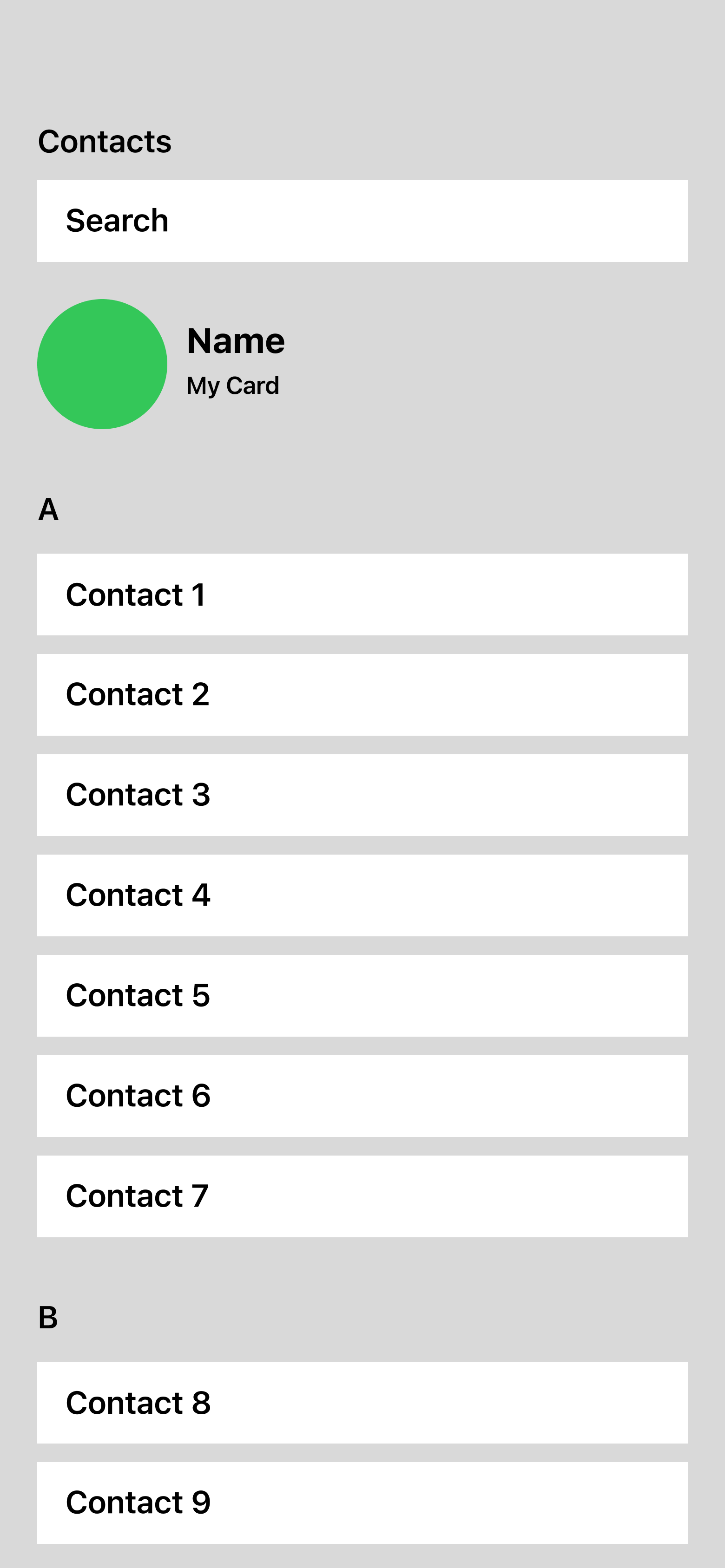
- Contacts (used to search for whoever you want to contact, or add a new contant)
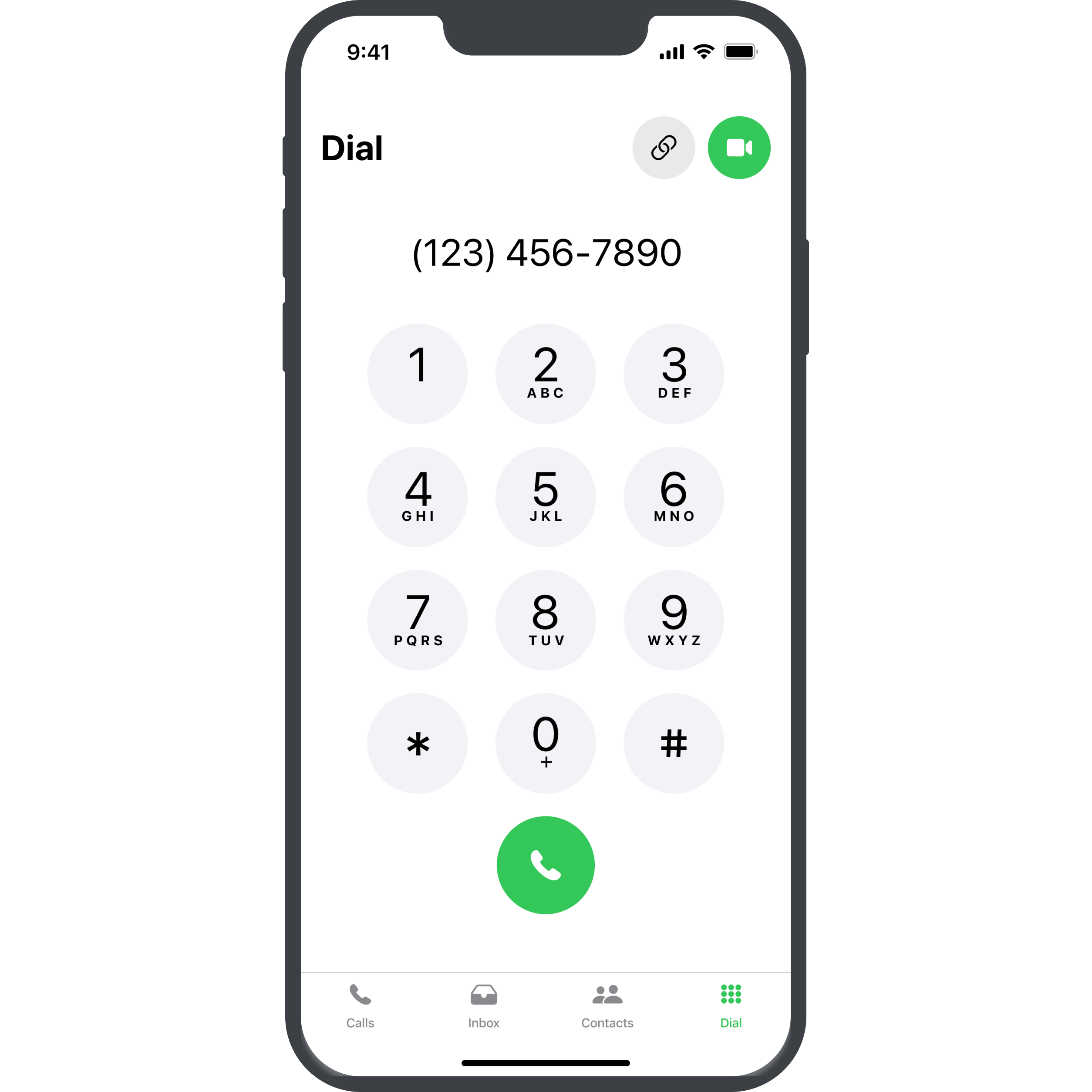
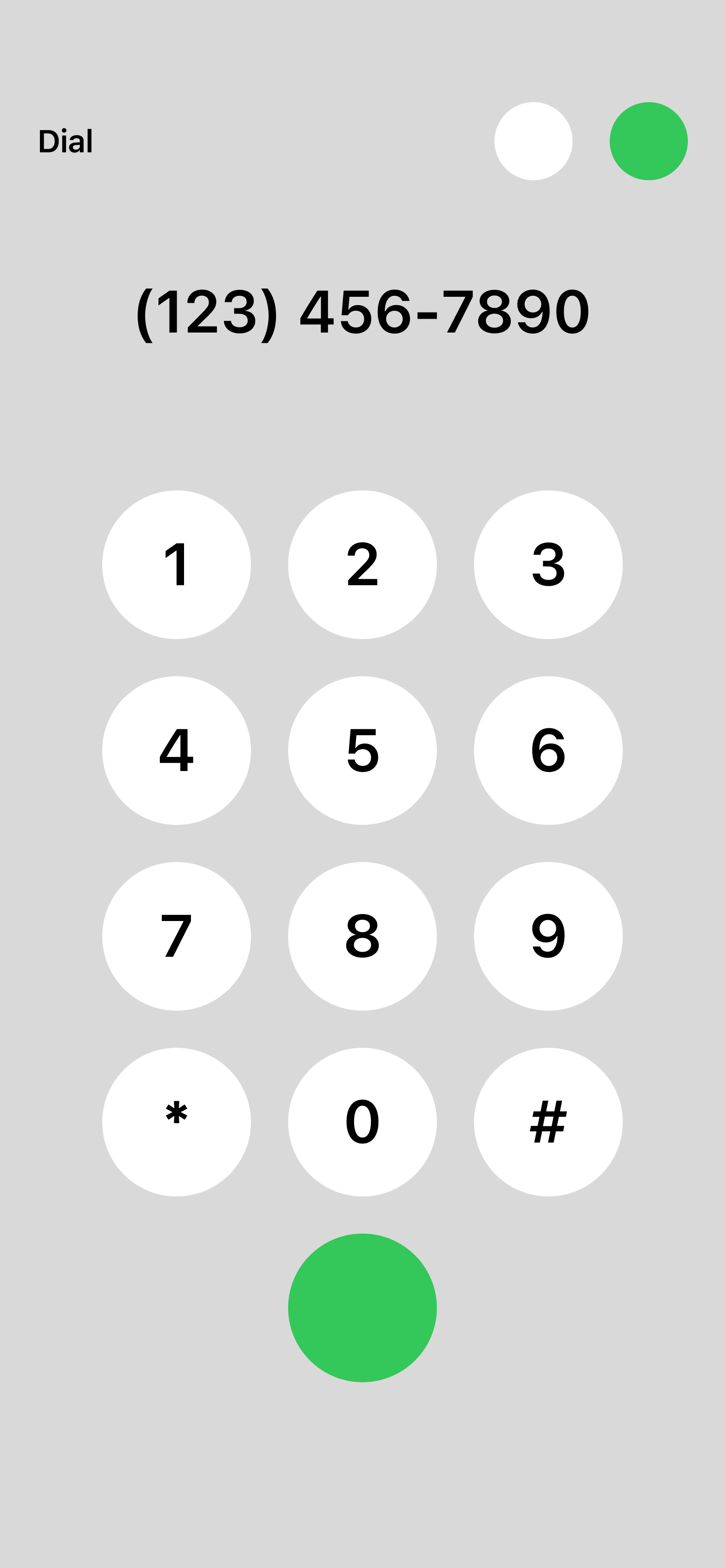
- Dial (still relevant for calling numbers you may not have saved or are calling for the first time)
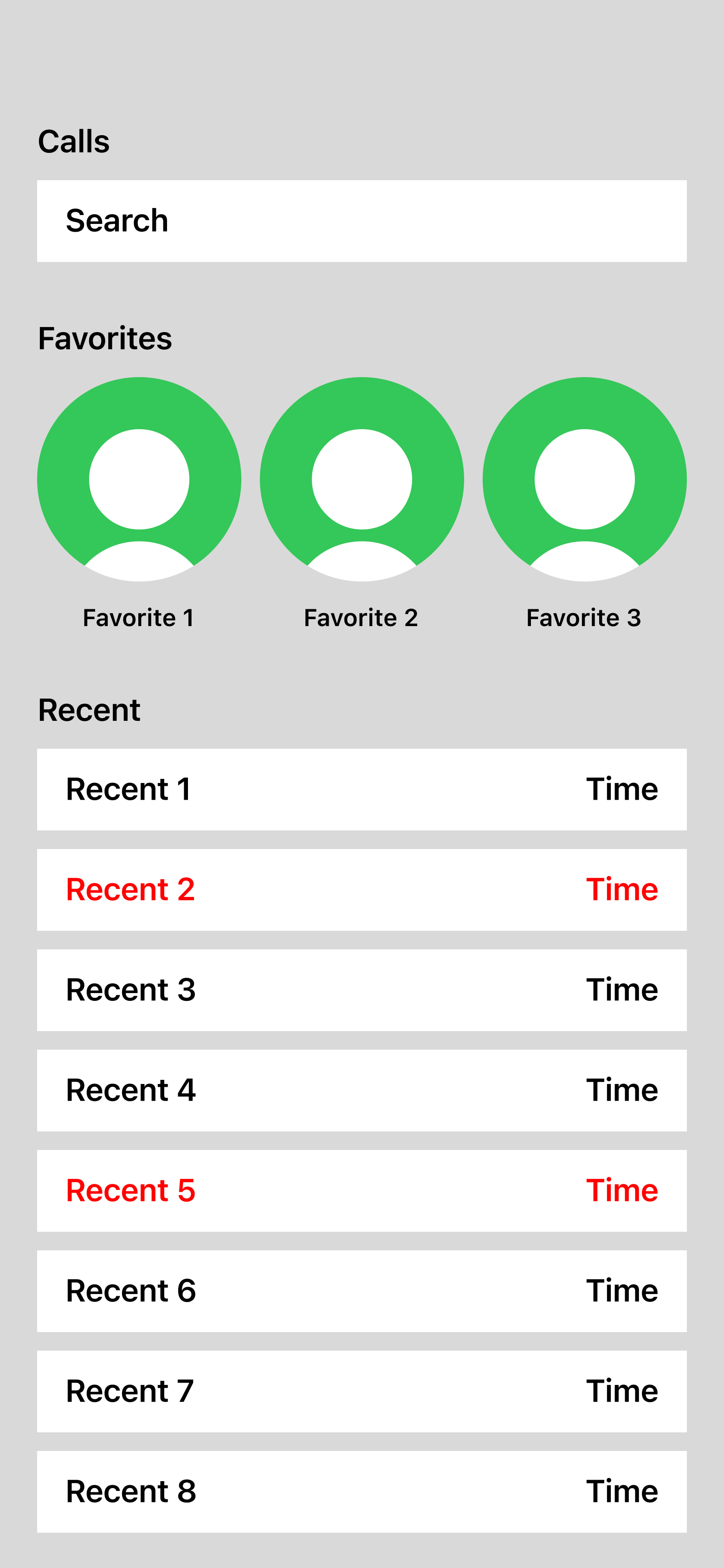
I started this project by greyboxing the different current elements that are present within the different Calls-related screens in iOS. These include:
- Favorite Contacts
- Recent Calls List
- Search Bar
- FaceTime Messages (new addition in iOS 17)
- Contact List
- Dial
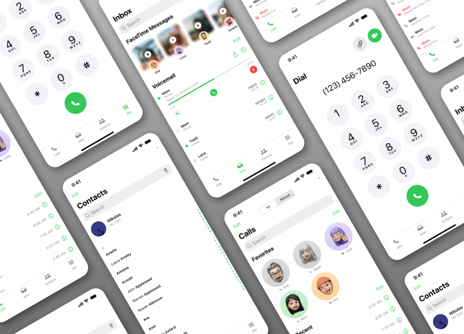
Afterwards, I started combining them into different layouts, until I found 4 screens that I felt were very “Apple” in their base design, but still had some new added functionality and fresh layouts.
After having selected and created greyboxes for the screens that I wanted to create, I started looking into the offical iOS UI library for Figma.
Since I mainly tried to tie already existing screens, and not necessarily create entirely new elements, it was easy for me to reference the live apps on my phone, to check out spacings, colors, etc.
I created high-fidelity mockups for all the four greyboxes that I made, including a light and a dark version for all of them.
To conclude, I want to say that I would really love to see Apple combine these apps into one coherent ecosystem.
One of the main reasons for this which I could see is having a single, one-stop location for all these tasks, which would allow users to put this one app into their dock and access all functionalities at the same time.