

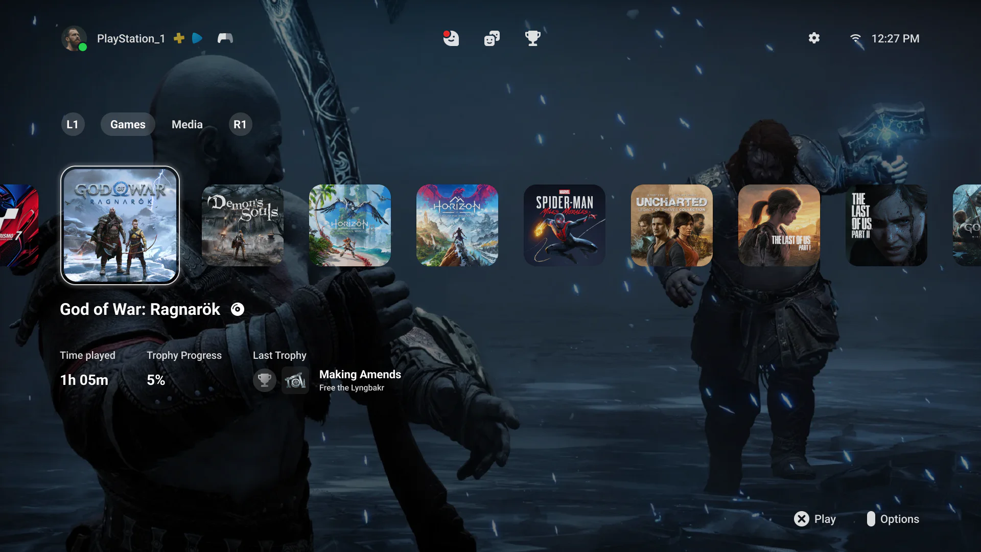
PS5 Home Screen Concept
About
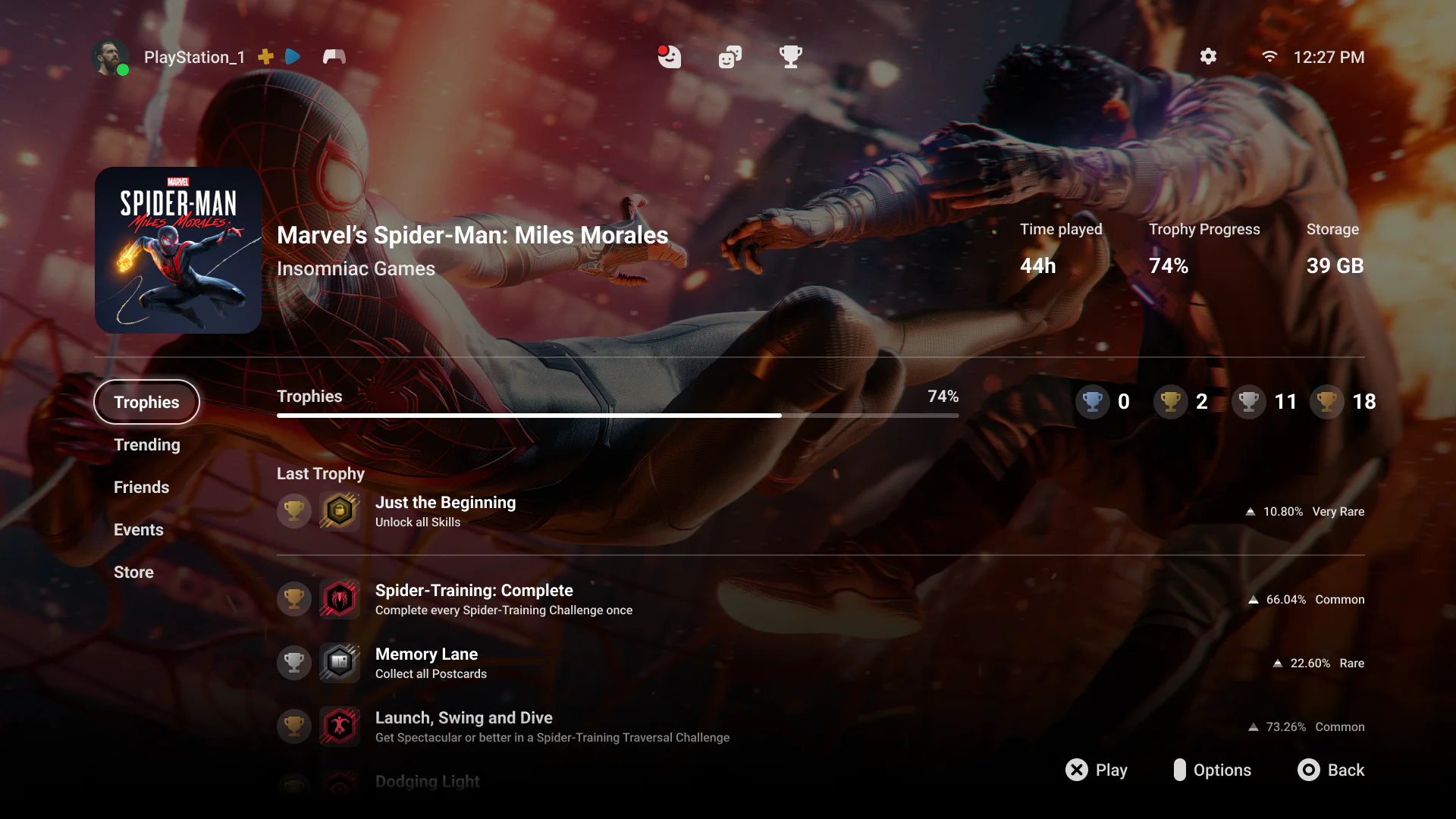
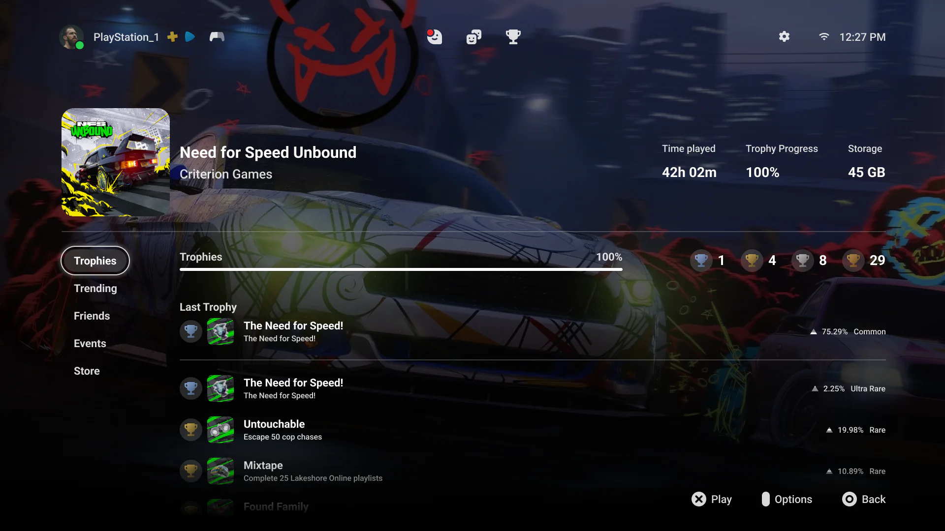
Before Sony revealed the PlayStation 5 interface, I created my own interpretation of what its home screen could look like.
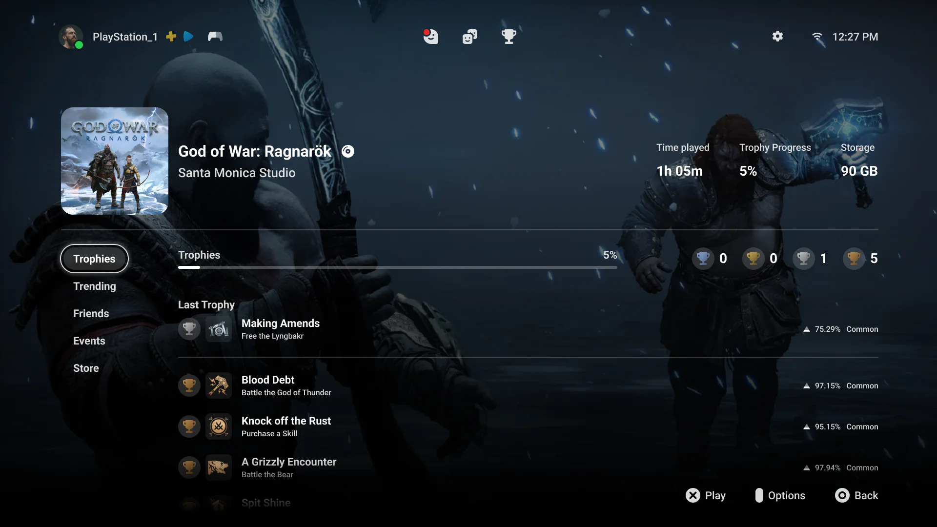
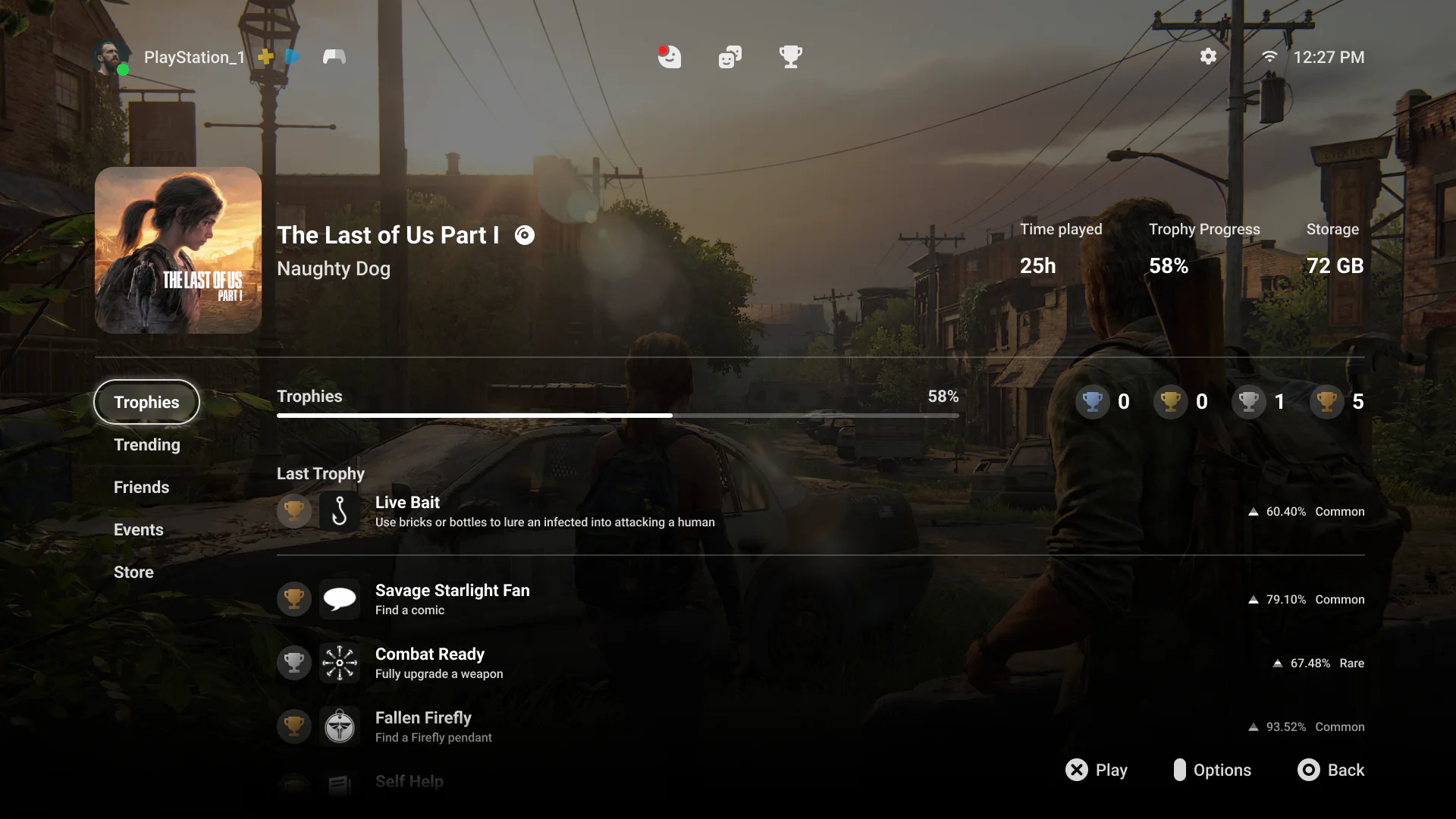
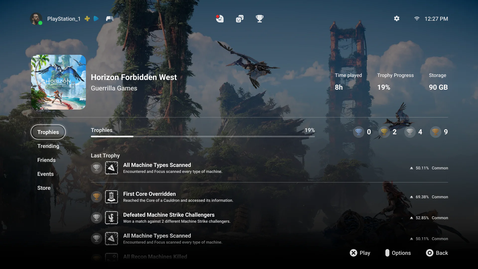
I drew inspiration from modern interface design, combining clean square tiles with softened corners and a more contemporary visual language. The concept is highly functional as well, bringing more useful information onto the screen through button prompts, controller charge indicators, trophy progress, playtime, and other contextual details.
Gallery

Goals
Identity
PlayStation is a strong brand with a distinctive visual character. Building on the simpler, cleaner direction established during the PS4 era, I used restrained forms and clear shape language throughout the concept.
Usability
A console interface should empower people to start playing rather than get in their way. I kept games at the center of the experience and extended their artwork into the background so each selection already feels like entering its world.
Simplicity
The interface needed to feel engaging without becoming overwhelming. Information is clearly grouped into focused sections so players can quickly direct their attention to games, progress, social activity, or system actions.