

iOS Calls Rework
About
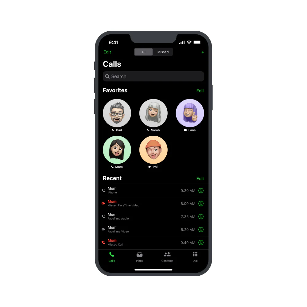
For some time, I felt that the iOS calling ecosystem was unnecessarily divided across several apps even though their behaviors and user journeys are closely related. This case study explores combining Phone, FaceTime, and Contacts into one coherent experience.
Final Result

Goals & Objectives
Authentic
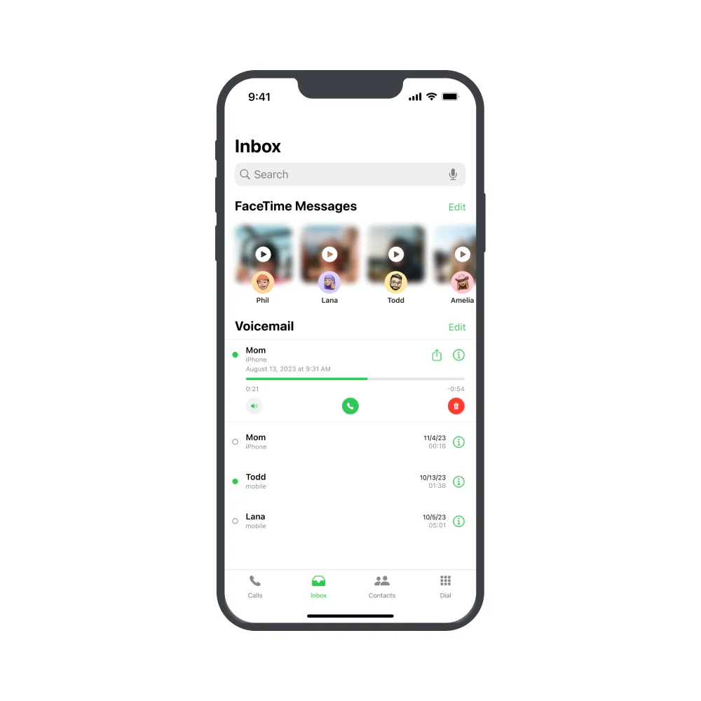
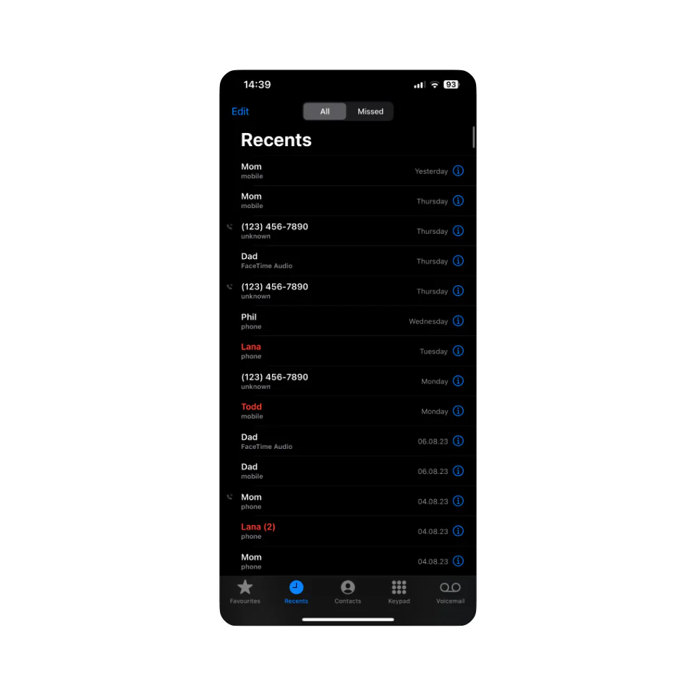
A central goal was to make the concept feel official—unmistakably Apple. I used Apple’s iOS 17 design kit and limited the work to established iOS icons, panels, spacing, typography, and interaction patterns.
Useable
The second goal was to remove the friction of completing closely related calling tasks across separate apps. I combined them into one efficient destination and made every major area quick to reach.
Research
I began by reviewing the three apps I wanted to bring together:
- Phone
- FaceTime
- Contacts
After collecting references, I selected the core destinations to carry into the combined design:
- Calls — call favorite contacts or quickly return recent calls.
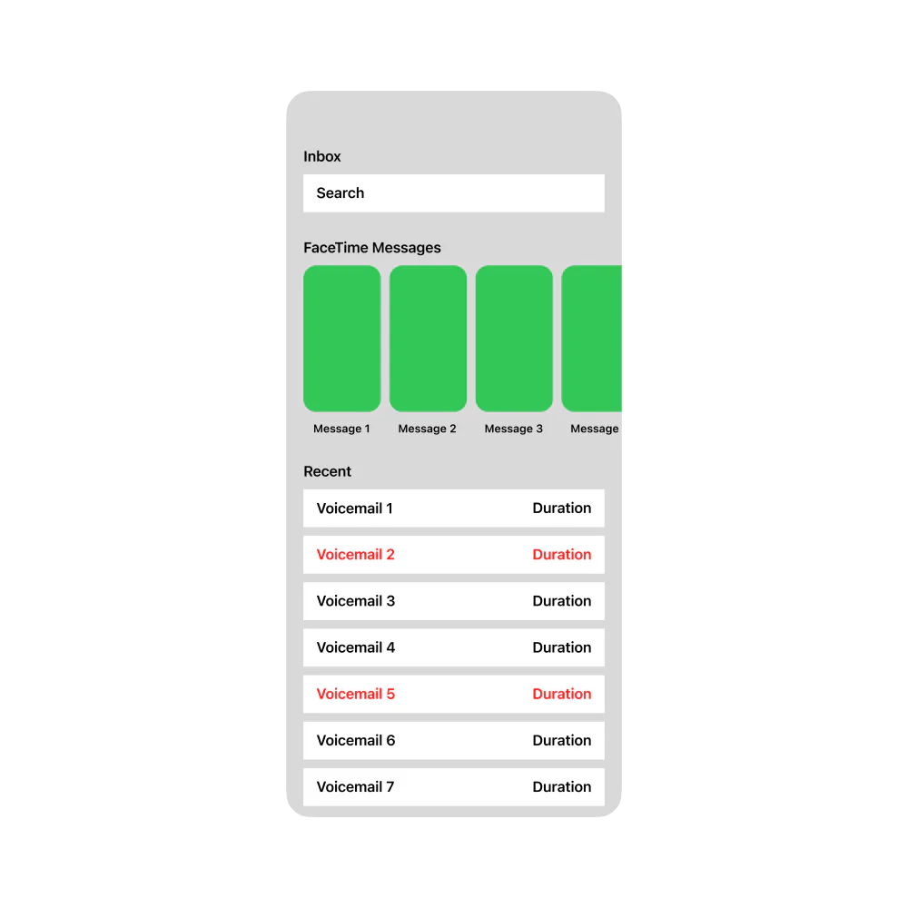
- Inbox — review missed calls, voicemail, and the FaceTime video messages introduced in iOS 17.
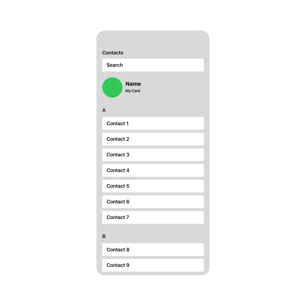
- Contacts — find someone to contact or add a new person.
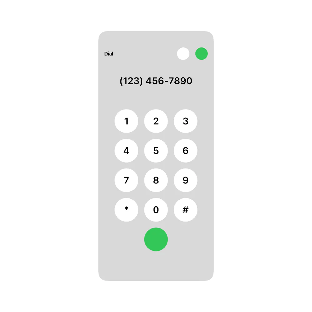
- Dial — call a number that has not yet been saved.

Greyboxing
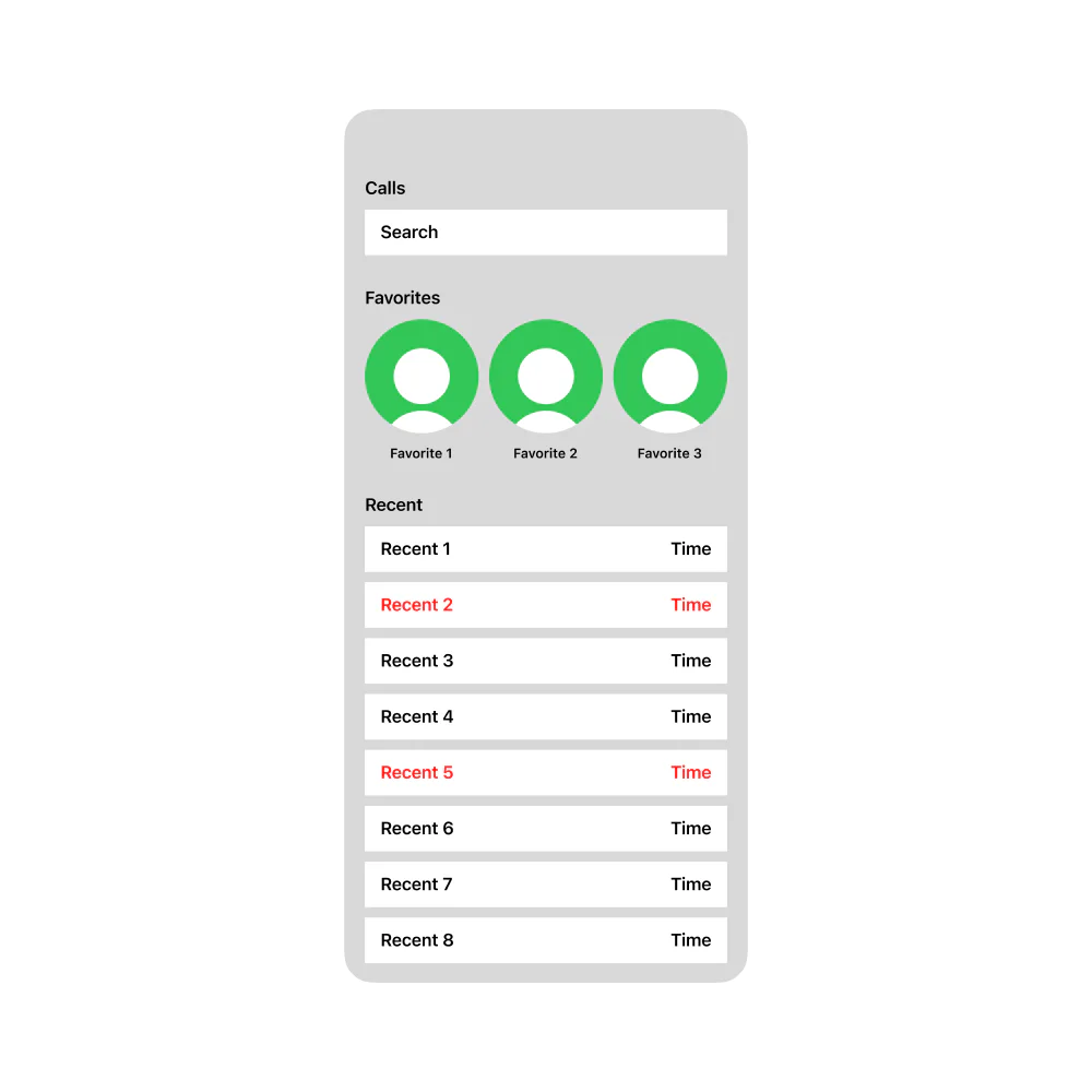
I began by greyboxing the recurring elements found across iOS calling screens:
- Favorite contacts
- Recent calls
- Search
- FaceTime messages
- Contacts
- Dial pad
I combined these pieces through several layout explorations until I arrived at four screens that still felt distinctly Apple while introducing fresher layouts and a more efficient structure.
High-Fidelity
After selecting and greyboxing the screens, I moved into Apple’s official iOS UI library for Figma.
Because the concept primarily connects existing experiences rather than inventing an entirely new visual system, I could continuously reference the live apps on my phone for spacing, color, type, and component behavior.
I produced high-fidelity mockups for all four greyboxes in both light and dark appearances.
Conclusion
I would genuinely like to see Apple combine these apps into one coherent calling ecosystem.
A single destination would give people one reliable place for every calling-related task. It could live in the Dock and provide immediate access to calls, messages, contacts, and dialing without requiring users to remember which app owns each function.